Weight-loss pace design increases healthy choices by 900%.
Background
MyFitnessPal, a health app with over 200 million users, conducted research revealing that MyFitnessPal users were disproportionately setting minimum calorie goals.
The problem
There are two reasons minimum calorie goals are problematic:
Lower engagement & retention: Restrictive diets lead many users to discouragement and/or burnout. (I personally don't prefer being hungry all day!)
Poor nutrition: Not enough calories can mean missing essential nutrients, or unhealthy choices to "stay under budget."
Set for success
Our team, consisting of a Product Manager, Sr. Product Designer (me), Tech Lead, and Writer, kicked off discovery to tackle this challenge. We asked:
"How might we set users up for success with the initial calorie goal recommendation we provide?"
After research and other exploration, we felt that framing the question around change was the clearest and most healthful route for the user. However, we conducted user testing to confirm our assumptions about the framing and design.
Testing our assumptions
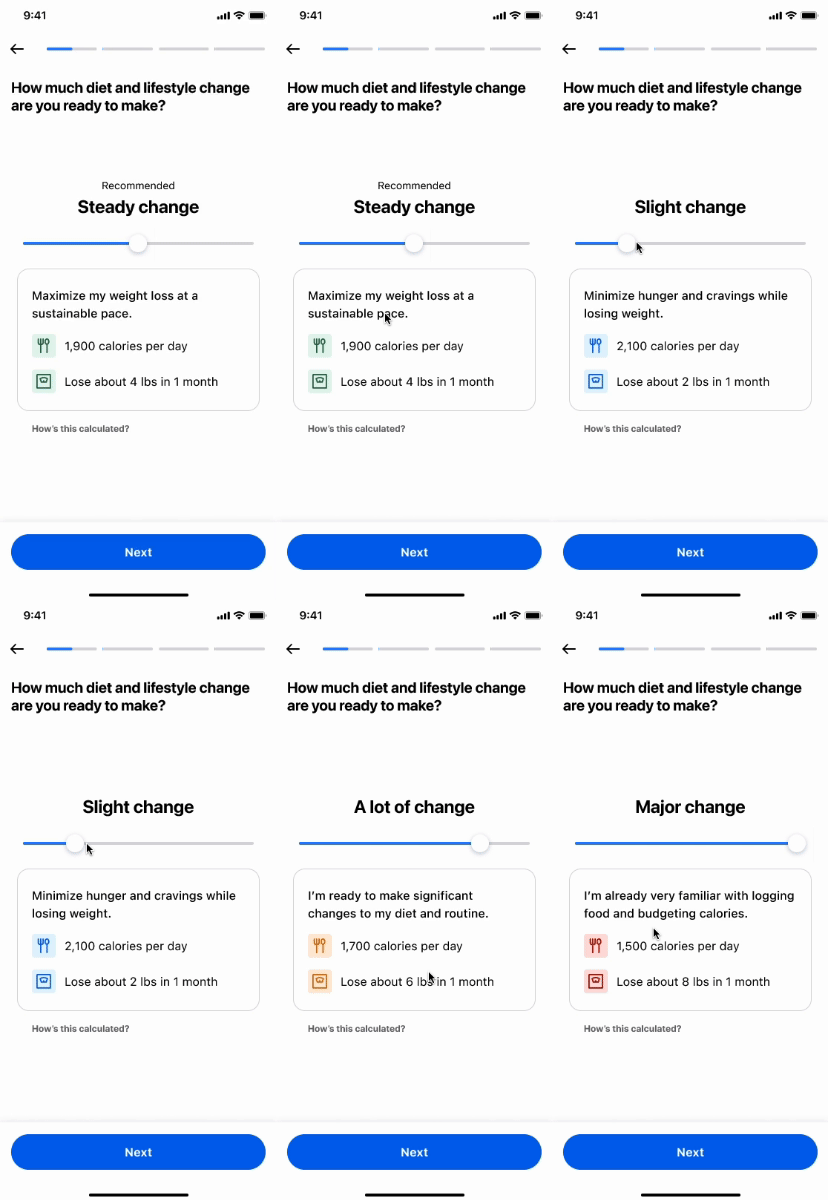
We had a hypothesis that if we default the weight loss pace to the recommended choice, users will be inclined to keep and be content with that option, versus changing it to the fastest, less healthy pace.
We tested with users who were interested in weight loss and health apps but hadn't previously used the app in order to avoid any bias, and learned the following:
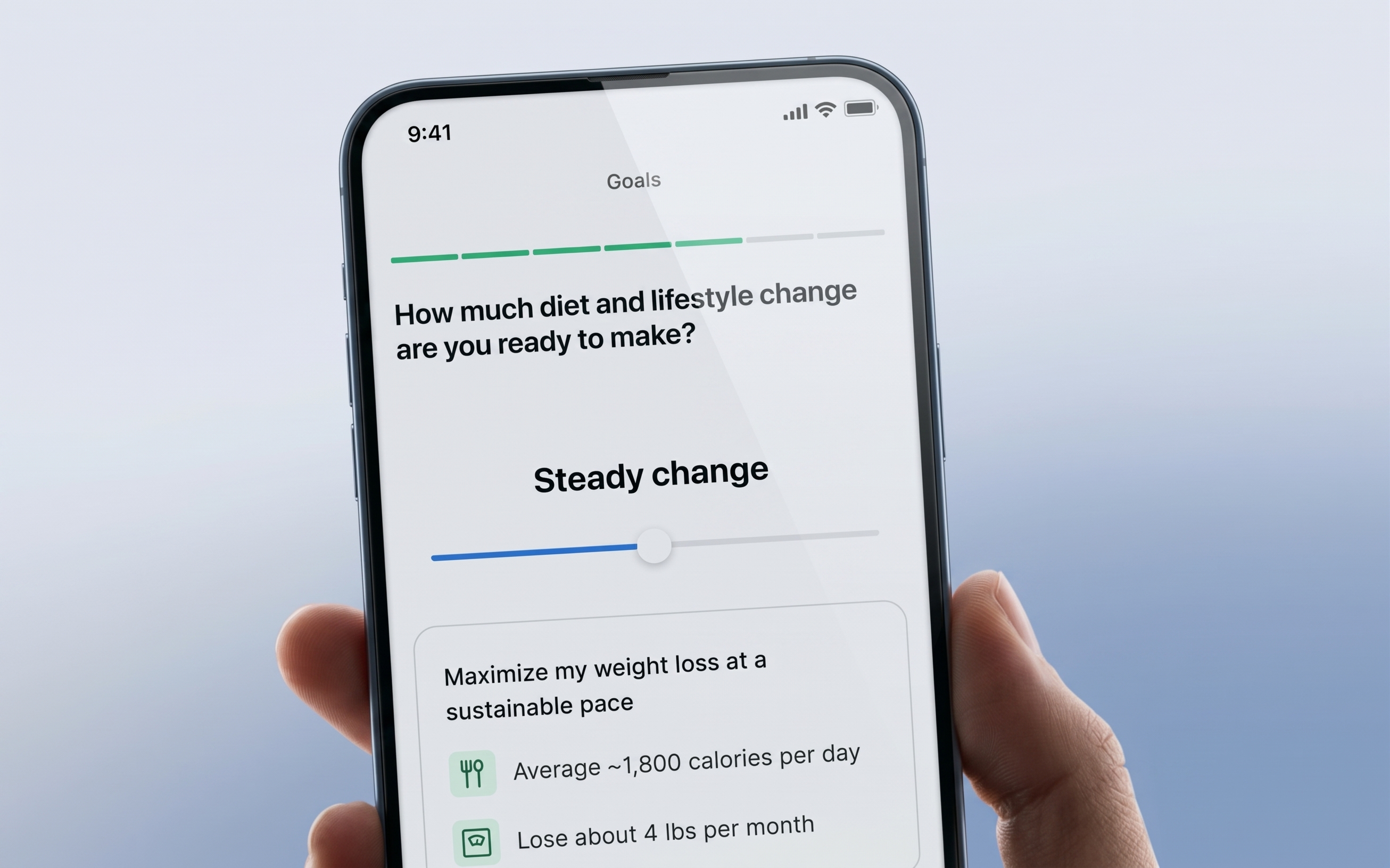
- Users want to know the effects on calories and weight loss per month on the weight-loss pace page to choose the best pace for them.
- They prefer to be asked, "How much diet and lifestyle change are you ready to make?" vs. how quickly they would like to lose the weight.
The exception
As we worked toward a solution, we considered three distinct BMI groups: over 35 BMI, 27–35 BMI, and under 27 BMI.
Our solution worked well for the first two groups because we could provide safe calorie recommendations, but we needed to adjust the approach for the under 27 BMI group, which could put users on a calorie limit that was against the BMI recommendations.
Recommendation
Following the health guidelines rendered the selection slider useless, with only one recommended option. We tested concepts for this BMI group and came up with a similar but slightly different experience, simply showing a page with their recommendation, coupled with a bottom sheet informing the user that they can customize this weekly weight loss goal within the app.
When we first tested this simpler recommendation experience for users with a BMI under 27, we learned that their retention ended up lower than the control group. As a result, we tested a version that skipped this screen for the under 27-BMI users, with the intention to test new iterations for them in the future.
Results